

















For most businesses, the first point of contact with a customer now happens on a screen. A website, a social feed, a booking form or an email usually does the heavy lifting. But as digital interactions become faster, flatter and more interchangeable, some companies are rediscovering the quiet influence of physical touchpoints.
In a world where almost everything is swiped, scrolled or tapped, what people can actually hold in their hands has started to stand out again.

The psychology of touch and trust
Research in behavioural psychology suggests that people associate physical weight, texture and resistance with quality and value. Heavier objects are often perceived as more important, while textured surfaces can signal care and deliberation, effects that work subtly, often below the level of conscious thought. See BBC Worklife’s reporting on how touch influences perception and decision-making.
In commercial terms, that means physical details can influence how a brand is judged before a single word is read. A thick menu, a well-made invitation or thoughtfully packaged product slows people down. It asks for attention in a way digital content rarely can.
This does not mean that tactile elements replace digital ones. Instead, they tend to reinforce impressions already formed online, for better or worse.
Where tactile branding shows up in everyday business
For many Oxfordshire businesses, tactile branding appears in places so familiar they are often overlooked.
Hospitality venues use paper stock, finishes and layout to signal whether a space is casual or refined before food even arrives. Independent retailers rely on packaging to make a purchase feel deliberate rather than disposable. Professional services firms still use printed proposals, welcome packs or certificates where trust and credibility matter more than speed.
Cultural organisations and events also lean on physical programmes, tickets or signage to establish tone and atmosphere. These are rarely described as “branding” decisions, but they shape how people feel about an experience as a whole.
Print as one signal, not the whole story
Print is often where conversations about tactile branding end up, but it is only one part of a wider system. On its own, a business card or brochure does very little. In context, however, it can reinforce consistency.
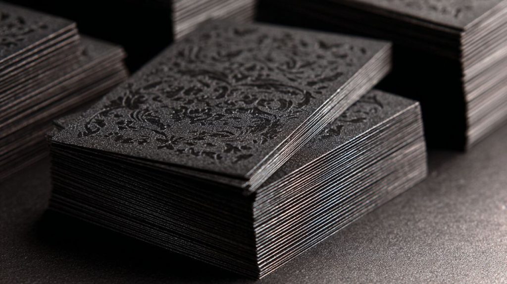
Paper weight, finish and restraint can quietly communicate intent. For example, some businesses choose soft-touch or velvet-finish materials to complement a brand that positions itself as calm, considered or premium. Others opt for uncoated stock to signal sustainability or simplicity, reflecting guidance from organisations such as the Forest Stewardship Council (FSC UK) on responsible paper use.
Finishes such as soft-touch laminates, spot UV or velvet-effect textures can be used to reinforce that message. For example, some businesses opt for business cards that have a velvet finish as part of a wider suite of printed materials. Used well, these touches often go unnoticed precisely because they feel right.
Why this matters for Oxfordshire businesses
Oxfordshire has a high concentration of sectors where trust, reputation and long-term relationships matter: professional services, independent hospitality, education, culture and heritage-led tourism among them.
Local economic bodies such as Oxfordshire Local Enterprise Partnership highlight the county’s mix of knowledge-led businesses, visitor economy and independent enterprises, where credibility and experience often matter as much as price.
In these environments, customers are rarely making snap decisions. They are assessing tone, credibility and fit. Small physical details; a well-designed menu, a thoughtfully presented document, a consistent look across online and offline materials, can influence those judgements.
As competition increases online, these quieter signals can help local businesses differentiate themselves without resorting to aggressive marketing.
Common mistakes to avoid
One of the most frequent errors is mistaking expense for quality. Heavy materials, elaborate finishes or complex designs do not automatically signal sophistication. In some cases, they can even undermine it.
Another mistake is inconsistency: a carefully designed printed piece that bears little resemblance to a business’s website, tone of voice or service experience. The Design Council has repeatedly highlighted consistency as a core principle of effective design and branding.
Perhaps most common of all is treating physical materials as an afterthought — something added at the end of a process rather than considered as part of the overall customer journey.
Practical questions worth asking
Rather than thinking in terms of “luxury”, businesses may find it more useful to ask:
- Where does a customer first encounter something physical from us?
- Does it reflect the same care as our digital presence?
- Is it intentional, or simply habitual?
- Does it make the experience easier, clearer or more reassuring?
These questions apply whether the answer is better paper, simpler packaging, or fewer physical touchpoints used more thoughtfully.
Quiet signals in a noisy world
Tactile branding is not about nostalgia for print or resistance to digital change. It is about recognising that, in an environment saturated with content, people still respond to care, coherence and restraint.
For businesses navigating an increasingly crowded marketplace, the most effective signals are often the least obvious, felt rather than announced.